 | Cascading Style Sheets: The Definitive Guide |  |

A lot of CSS properties, such as margins, depend on length measurements in order to properly display various page elements. It probably comes as no surprise to you, then, that there are a number of ways to measure length in CSS.
All length units can be expressed as either positive or negative numbers, followed by a label -- although some properties will only accept positive numbers. They are also real numbers; that is, numbers with decimal fractions, such as 10.5 or 4.561. All length units are followed by a two-letter abbreviation that represents the actual unit of length being specified, such as in (inches), or pt (points). The only exception to this rule is a length of 0 (zero), which need not always be followed by a unit.
These length units are divided into two types: absolute units and relative units.
No vodka jokes, please. We start with absolute units because they're easiest to understand, despite the fact that they're almost unusable in web design. The five types of absolute units are as follows:
As you might expect, the inches one finds on a ruler in America. The fact that this unit is even in the specification, given that almost the entire world uses the metric system, is an interesting insight into the pervasiveness of American interests on the Internet -- but let's not get into virtual sociopolitical theory right now.
The centimeters that one finds on rulers the world over. There are 2.54 cm to an inch, and one centimeter equals 0.394 inches.
You guessed it. For those Americans who are metric-challenged, there are 10 millimeters to a centimeter, so you get 25.4 mm to an inch, and 1 millimeter equals 0.0394 inches.
Now it gets interesting. Points are standard typographical measures, used by printers and typesetters for decades and by word-processing programs for many years. By definition, there are 72 points to an inch, since points were defined before use of the metric system had really caught on. Therefore, the capital letters of text set to 12 points should be a sixth of an inch tall. For example, P {font-size: 18pt;} is equivalent to P {font-size: 0.25in;}.
Another typographical term. A pica is equivalent to 12 points, which means there are 6 picas to an inch. As above, the capital letters of text set to 1 pica should be a sixth of an inch tall. For example, P {font-size: 1.5pc;} would set text to be the same size as the example declarations found in the definition of points.
These units are, of course, only really useful if the browser knows all the details of the monitor on which your page is displayed, or the printer you're using to generate hard copy, or whatever other user agent you might be using.
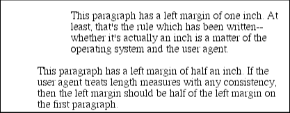
The sorts of things that can affect the display in a web browser, for example, are the size of the monitor and the resolution to which the monitor is set. Of course, there isn't a lot that you, as the author, can do about this. You can only hope that even if the browser can't get all that information, at least the measurements will be consistent in relation to each other; that is, a setting of 1.0in will be twice as large as 0.5in, as shown in Figure 3-3.

As a Windows user, you might be able to set your display driver to use real-world measures. Try clicking on the Start button, pointing to Settings, then clicking Control Panel, and from the Control Panel window double-click on Display. On the Display dialog box there should be a Settings tab. Click on this, and then click on the Advanced button to reveal a dialog box which may be different on each PC. You should see a section labeled Font Size, in which case select Other, and then hold a ruler up to the screen and move the slider until the two match. Finally click OK several times and you're set!
If you're a Macintosh user, there isn't a place to set this information, but that's all right -- the Mac OS has already made an assumption about the relationship between on-screen pixels and absolute measures, by declaring your monitor to have 72 pixels to the inch. This assumption is totally wrong, but it's built into the operating system, and therefore pretty much unavoidable, at least for now. (With any luck, future browsers will include a preference setting for defining your own pixel-per-inch value, thus circumventing any OS-imposed limitations.)
Therefore, on many Macintosh-based web browsers, such as Netscape 4.x, and Internet Explorer 3.x and 4.x, any point value will be equivalent to the same length in pixels: 24pt text will be 24 pixels tall, and 8pt text will be 8 pixels tall. This is, unfortunately, just slightly too small to be legible, despite the fact it looks pretty good on a Windows-based browser. Figure 3-4 illustrates the problem.

This is an excellent example of why points should be avoided when designing for the web. Ems, percentages, and even pixels are all preferable to points where browser display is concerned.
Despite all we've seen, let's make the highly suspect assumption that your computer knows enough about its display system to accurately reproduce real-world measures. In that case, you could make sure every paragraph has a top margin of half an inch by declaring P {margin-top: 0.5in;}. No matter what the circumstances, then, a paragraph will have a half-inch top margin, regardless of font size or anything else.
Absolute units are much more useful in defining style sheets for printed documents, where measuring things in terms of inches, points, and picas is much more common. As we've seen, attempting to use absolute measures in web design is fraught with peril at best, so let's turn to some more useful units of measure.
Far from being Einsteinian in nature, relative units are so called because they are measured in relation to other things. The actual (or absolute) distance they measure can change due to factors beyond their control, such as screen resolution, the width of the viewing area, the user's preference settings, and a whole host of other things. In addition, for some relative units, their size is almost always relative to the element that uses them and will thus change from element to element.
There are three relative length units: em , ex , and px . The first two stand for "em-height" and "x-height," which are common typographical measurements; however, in CSS, they have meanings you might not expect if you are familiar with typography. The last type of length is px , which stands for "pixels." A pixel is one of the dots you can see on your computer's monitor if you look closely enough. This value is defined to be relative because it depends on the resolution of the display device, a subject that we'll discuss at length.
First, let us consider em and ex . In CSS, one "em" is the value of font-size for a given font, so if the font-size of an element is 14 points, then for that element, one "em" is the same as 14 points. In other words, whatever size you set the font's size to be, that's the value of one em for that element. In relation to a paragraph of 18-point text, the length of an em is 18 points.
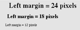
Obviously, this value can change from element to element. For example, given an H1 whose font is 24 pixels in size, an H2 element whose font is 18 pixels in size, and a paragraph whose font is 12 pixels, we get what's shown in Figure 3-5:
H1 {font-size: 24px;}
H2 {font-size: 18px;}
P {font-size: 12px;}
H1, H2, P {margin-left: 1em;}

<H1>Left margin = 24 pixels</H1>
<H2>Left margin = 18 pixels</H1>
<P>Left margin = 12 pixels</P>
The only exception to this rule is setting the size of the font, in which case the value of em is relative to the parent element (this is shown in Figure 3-6):
SMALL {font-size: 0.8em;}

<P>Although this text is the default size for the user agent, the
<SMALL>small-text element</SMALL> within the paragraph has a font
size which is 80% the rest of the text in the paragraph.</P>
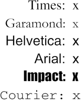
ex , on the other hand, refers to the height of a lowercase x in the font being used. Therefore, if you have two paragraphs of text in which the text is 24 points in size, but each paragraph uses a different font, then the value of ex could be different for each paragraph. This is because different fonts have different heights for x, as we see in Figure 3-7.

Even though the examples use 24-point text, and therefore each have an em of 24 points, the ex for each is different.
This is all difficult enough, but just to make things more so, this is all what's supposed to happen in theory. In practice, however, many user agents get their value for ex by taking the value of em and dividing it in half. Why? Well, apparently most fonts don't have the value of their x-height built in, and it's a difficult thing to compute. Since most fonts have lowercase letters that are about half as tall as uppercase letters, it's a convenient fiction to assume that 1ex is equivalent to 0.5em . It is hoped that, as time goes on, user agents will start using real values for ex , and the half-em shortcut will fade into the past.
Now to pixels, where the situation gets really confusing. On the face of things, pixels really should be very straightforward. After all, if you look at a monitor closely enough, you can see that it's broken up into a grid of tiny little boxes. Each box is a pixel. However, how many of those boxes equal an inch? If the monitor is set to be 1,024 pixels wide by 768 pixels tall, and the monitor's screen is exactly 14.22 inches wide by 10.67 inches tall, and the display area exactly fills the monitor, then each pixel will be 1/72 of an inch wide and tall. As you might guess, this is a very, very rare occurrence, especially since it's tough to find a monitor with exactly those dimensions. So it turns out that on most monitors, the actual number of pixels per inch (ppi) is higher than 72 -- sometimes much higher, up to 120 ppi and beyond.
To make things even more confusing, the CSS specification recommends a "reference pixel" which works out to roughly 90 ppi -- a measure very few (if any) operating systems actually use. While the specification assumes that 90px should equal 1in, nothing else really does, so that doesn't help. In general, if you declare something like font-size: 18px , then you're leaving it up to the user agent to decide how big a pixel really is. A web browser will almost certainly use actual pixels on your monitor -- after all, they're already there -- but with other display devices, like printers, the situation gets a little uncertain.
WARNING
One example of problems with pixel measurements can be found in an early CSS1 implementation. In Internet Explorer 3.x, when a document is printed, IE3 assumes that 18px is the same as 18 dots, which works out to be 18/300, or 6/100, of an inch -- or, if you prefer, .06in. That's pretty small text!
On the other hand, pixel measurements are perfect for expressing the size of images, which are already a certain number of pixels tall and wide. In fact, the only time you would want to use other units of measure to express the size of images is if you want them to scale along with the size of the text. This is an admirable and occasionally useful approach, and one which would really make sense if you were using vector-based images instead of pixel-based images. (With the adoption of Scalable Vector Graphics, this could actually become a reality.)
Given all the issues involved, the best measures to use are probably the relative measures, most especially em , and also px when appropriate. Since ex is at present basically a fractional measure of em , it's not all that useful for the time being. If user agents are ever able to support real x-height measures, then ex might come into its own.
With that, we close out our discussion of length measurements. The rest of the chapter is pretty straightforward and not nearly so pessimistic.

Copyright © 2002 O'Reilly & Associates. All rights reserved.